Grab The Discount | Flat Rs1000 off for new learners | Code: OFF1000
GT Academy, now revamped as LearninGT.com

Why data visualisation tools (Power BI) outperform spreadsheets today?
- November 6, 2025
In a world powered by data, businesses and individuals are constantly collecting, analysing, and interpreting lots of information to make informed decisions. While spreadsheets have long been the go-to tool for managing data, the rise of data visualisation tools has revolutionised how we understand and communicate information. This blog explores the effectiveness of spreadsheets and data visualisation, highlights the importance of data visualisation tools, discusses its types and concludes with why it’s a game-changer in modern analytics.
Spreadsheets are digital worksheets that allow users to organise, calculate, and analyse data using rows and columns. For example, Microsoft Excel and Google Sheets offer functionalities such as formulas, pivot tables, and charts, making data analysis more efficient. People widely use spreadsheets for:
Despite their versatility, spreadsheets have limitations when it comes to handling large datasets, real-time collaboration, and advanced data analytics.
Data visualisation is the graphical representation of information and data. When you present data using visual elements like charts, graphs and dashboards, users can identify patterns, trends and outliers. Business intelligence tools like Tableau and Power BI allows users to transform raw data into interactive and insightful visuals.
While both spreadsheets and data visualisation tools serve the purpose of data analysis, they differ significantly in terms of usability, scalability, and impact.
Data visualisation is not just about making data look presentable, it’s about making it meaningful. Here’s why it’s crucial:
There are various types of data visualisation techniques, each suited for different kinds of data and insights:
Q1 How do interactive dashboards improve decision-making?
A - Interactive dashboards give real-time insights, let users break-down data, and present information visually, helping managers spot trends and patterns to take the right action.
Q2 What industries use data visualisation tools the most?
A - Industries like finance, healthcare, retail, marketing, logistics and IT use data visualisation tools to track performance, forecast trends and make data-driven decisions.
Q3 How do data visualisation techniques help in risk management?
A - Data visualisation highlights anomalies, negative trends, or potential risks early through visuals like heat maps or trend graphs, enabling proactive risk mitigation.
While spreadsheets remain a valuable tool for basic data management and analysis, data visualisation tools offer a more powerful, scalable and intuitive way to understand and communicate data. In a world where data is growing exponentially, the ability to visualise information effectively is no longer a luxury, it’s a necessity.
Data visualisation techniques empower users to make smarter and faster decisions. Whether you're a business leader, analyst, or student, learning visualisation tools can transform how you interact with data and unlock deeper insights. If you’re planning to learn these amazing data visualisation tools, check out our hands-on Business Intelligence course and Data Visualisation course for you.
What are spreadsheets?
Spreadsheets are digital worksheets that allow users to organise, calculate, and analyse data using rows and columns. For example, Microsoft Excel and Google Sheets offer functionalities such as formulas, pivot tables, and charts, making data analysis more efficient. People widely use spreadsheets for:
- Budgeting and financial analysis
- Data entry and storage
- Simple reporting
- Project tracking
Despite their versatility, spreadsheets have limitations when it comes to handling large datasets, real-time collaboration, and advanced data analytics.
What is data visualisation?
Data visualisation is the graphical representation of information and data. When you present data using visual elements like charts, graphs and dashboards, users can identify patterns, trends and outliers. Business intelligence tools like Tableau and Power BI allows users to transform raw data into interactive and insightful visuals.
Spreadsheets vs. data visualisation tools: Which is more effective?
While both spreadsheets and data visualisation tools serve the purpose of data analysis, they differ significantly in terms of usability, scalability, and impact.
| Parameters | Spreadsheets | Data visualisation tools |
| Ease of understanding | Require users to interpret numbers and formulas manually. | Make data instantly understandable through visuals. |
| Scalability | Struggle with large datasets and complex relationships. | Can handle big data and integrate with multiple sources. |
| Collaboration | Offer limited real-time collaboration and version control. | Enable real-time sharing and interactive dashboards. |
| Decision-making | Provide detailed analysis but fail to deliver quick data insights. | Facilitate faster, data-driven decisions. |
| Automation and integration | Require manual updates and offer limited automation. | Connect to live data sources and updates automatically. |
How Data Analytics and Visualisation Help Businesses
Data visualisation is not just about making data look presentable, it’s about making it meaningful. Here’s why it’s crucial:
Enhances decision-making with data insights:
Data visualisation helps convert raw data into visuals like charts, graphs, and dashboards, making large data easier to understand. Managers can quickly grasp trends, patterns, and outliers, enabling faster and more informed decisions.
Example: A sales dashboard showing monthly revenue trends helps managers identify peak seasons and adjust marketing strategies accordingly.Improves communication across teams:
Teams can share and explain visual data more easily than spreadsheets full of numbers. Data visualisation tools allow managers to present insights clearly to stakeholders, team members, and executives, regardless of their technical background.
Example: A pie chart showing budget allocation across departments helps finance teams and department heads align on spending priorities.Identifies trends and patterns:
Visualisation helps uncover hidden trends that might be missed in tabular data. This presentation greatly helps in forecasting, market analysis and strategic planning.
Example: A line graph showing customer growth over time can reveal seasonal spikes or dips, guiding product launches or promotional campaigns.Enables real-time monitoring:
Modern data visualisation tools connect to live data sources, allowing managers to monitor performance metrics in real time. These tools benefit operations, sales and customer service by enabling real-time monitoring.
Example: A real-time dashboard tracking website traffic and conversion rates helps marketing teams adjust campaigns instantly.Builds data-driven culture:
By using charts and graphs to present data, visualisation builds a culture where teams make decisions based on evidence rather than intuition. This leads to more consistent and measurable outcomes.
Example: HR managers using visual reports on employee performance and engagement for better decision-making about training and retention.Facilitates risk management:
Visualisation helps identify risks early by highlighting anomalies or negative trends. Managers can take proactive steps to mitigate issues before they escalate.
Example: A heat map showing declining product sales in specific regions can prompt a review of local marketing efforts or distribution channels.Boosts productivity and efficiency:
Instead of spending hours analysing spreadsheets, managers can use visual dashboards to get data insights instantly. This approach saves time and lets users focus on key tasks.
Example: Operations managers using a dashboard to track supply chain metrics can quickly spot delays and reroute shipments.Customisation and interactivity:
Data visualisation tools offer interactive features like filters, drilldowns and dynamic updates. Managers can explore data from different angles without needing technical skills.
Example: A dashboard with filters for region, product, and time period allows managers to customise views based on their needs.
Types of data visualisation
There are various types of data visualisation techniques, each suited for different kinds of data and insights:
- Charts
|
Bar charts Compare categories  |
Line charts Show trends over time  |
Pie charts Display proportions 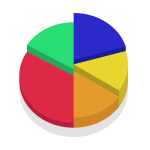 |
- Graphs
|
Scatter plots Show relationships between variables 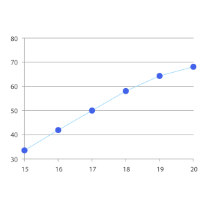 |
Bubble charts Add a third dimension to scatter plots  |
- Maps
|
Heat maps Show intensity or frequency. 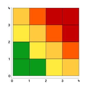 |
Geographical maps Visualise location-based data. 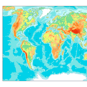 |
- Dashboards
|
Combine multiple visualisations into a single interface for real-time monitoring 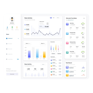 |
- Infographics
|
Blend visuals and text to tell a story or summarise data. 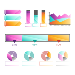 |
Types of data visualisation tools
- Business intelligence (BI) tools: These tools are designed for enterprise-level data analysis and reporting. They connect to various data sources and offer interactive dashboards.
- Examples:
- Tableau: Known for its powerful visualisations and drag-and-drop interface.
- Microsoft Power BI: Utilised well with Microsoft products and helps design interactive and real-time dashboards.
- Looker (by Google): Great for embedded data analytics and data modeling.
- Best for: Business reporting | Executive dashboards | KPI tracking
- Spreadsheet-based tools with visualisation features: These tools are primarily spreadsheets but include built-in charting and graphing capabilities.
- Examples:
- Microsoft Excel: Helps create bar charts, pie charts, graphs, and more.
- Google Sheets: Cloud-based with collaborative charting features.
- Best for: Quick data analysis | Small datasets | Non-technical users
- Infographic and design tools: These data visualisation tools are used to create visually appealing infographics and static data visuals.
- Examples:
- Canva: Easy-to-use design tool with chart templates.
- Piktochart: Focused on infographics and reports.
- Venngage: Great for non-designers to create data visuals.
- Best for: Marketing reports | Educational content | Social media visuals
FAQs
Q1 How do interactive dashboards improve decision-making?
A - Interactive dashboards give real-time insights, let users break-down data, and present information visually, helping managers spot trends and patterns to take the right action.
Q2 What industries use data visualisation tools the most?
A - Industries like finance, healthcare, retail, marketing, logistics and IT use data visualisation tools to track performance, forecast trends and make data-driven decisions.
Q3 How do data visualisation techniques help in risk management?
A - Data visualisation highlights anomalies, negative trends, or potential risks early through visuals like heat maps or trend graphs, enabling proactive risk mitigation.
Conclusion
While spreadsheets remain a valuable tool for basic data management and analysis, data visualisation tools offer a more powerful, scalable and intuitive way to understand and communicate data. In a world where data is growing exponentially, the ability to visualise information effectively is no longer a luxury, it’s a necessity.
Data visualisation techniques empower users to make smarter and faster decisions. Whether you're a business leader, analyst, or student, learning visualisation tools can transform how you interact with data and unlock deeper insights. If you’re planning to learn these amazing data visualisation tools, check out our hands-on Business Intelligence course and Data Visualisation course for you.